20 of 50


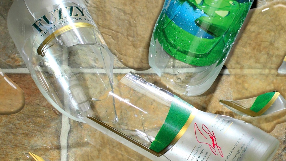
I had anticipated that possibility and brought clear packing tape. ‘Pre-tape’ the sections we needed, add one hammer, a brisk ‘tap’ and voila . . . we got pretty much what we wanted.
Look very closely at the enlarged photo and you can still see small sections of the tape that had to stay attached. Had we removed them, that bottle section would have come apart.
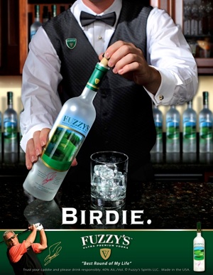
Getting the water on the floor to look right, and the highlights on the black shoes was also time consuming . . . but worth it.
And yes, we did ‘Photoshop’ it a little . . . but not much.
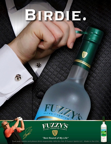
A total of six posters/advertisements were published.
Please Note: These are VERY LOW RESOLUTION sample images. The ‘originals’ are much CLEARER and more VIVID.


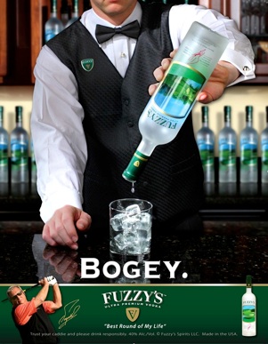
And for you ‘curious’ observers, that really is liquid pouring from the bottle . . . HOWEVER, it was not vodka, and it was not shot at the same time as the rest of the photo.
To get a ‘natural’ looking stream of ‘vodka’, a few days later on a bright sunny day we went outside with 1) the broken bottle neck we had left over from the ‘Disqualified’ photo, 2) a reflector, 3) a black piece of foamcore, and 4) a small pail of water.
We leaned the black foamcore up against a fence and carefully positioned the broken bottle neck on a block of wood. Then we poured water into the bottle neck while I held the reflector directing the sunlight through the water at the proper angle.
While the water coming out of the bottle neck was quickly changing shape, I used my other hand and ‘snapped’ many photos. We went back inside and selected the ‘best’ pouring shot.
And . . .
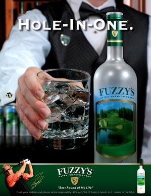
In the ‘Hole-In-One’ photo below, the hand and the tumbler it’s holding were shot separately as there is NO WAY you could position the model’s body and arm and still get their hand positioned that way.
BTW, those fake ice cubes are very expensive!
Lastly, mix in a little ‘Photoshop’ and you have some great looking posters.

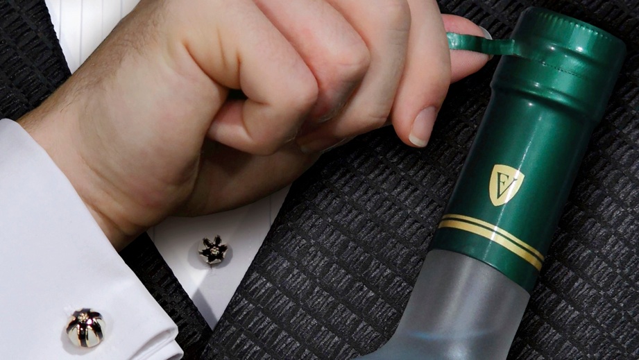
These photos were taken for a national advertising campaign for “Fuzzy’s Vodka”. Smashgraphix designed the layout.
This photo session was very critical. Discussions were held over seemingly ‘minor’ details, but in reality, were absolutely necessary to get the most out of each composition.
We even set up a computer at the shoot to enlarge and critique each shot. If it met our standards, we would then e-mail a low res proof to the client’s art director for final approval before proceeding to the next shot.
For the broken bottle shot, we ‘destroyed’ one bottle just to test how it would break. (It essentially turned to dust!)
CLICK THIS PHOTO TO ENLARGE
About • Philosophy • DVDs • Video • Photography • Interactive • Audio • Promotions • Web • Talent • Contact Us